GENDER 101 branding
The GENDER 101 project designed its branding strategy – of which this website is a key propagator, based on logo and visual identity.
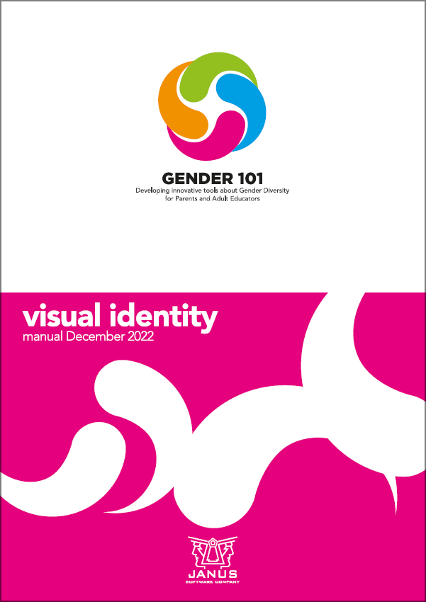
The elements composing the GENDER 101 logo are four in order to make the visual impact immediate, but they represent an unlimited number of players. These elements are single units with different colours indicating individual diversities. Such diversities join through a movement between different dimensions, from full frame to close-up. This movement highlights how these diversities, all together, take part in the creation of a new more solid and richer entity.
These dynamics representing inclusion and awareness are meant to depict the focus of the GENDER 101 project.
GENDER 101 Visual Identity manual